Most of us are familiar with the color wheel from elementary school art classes. While learning our colors is elementary enough, the study and implementation of color theory is not. It plays a huge role in design practice. A good designer understands how colors affect and play off of one another, even how they affect our mental state, and utilizes that when practicing design.
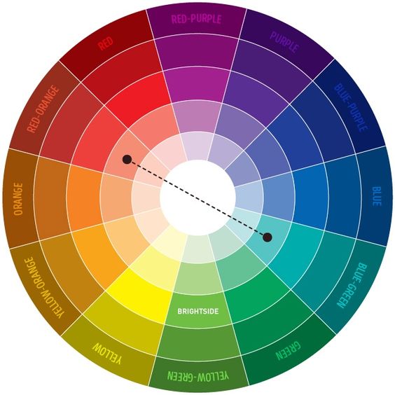
Complimentary colors, when used together in color schemes, are especially pleasing to the eye. Complimentary colors are the combination of any 2 colors opposite each other on the color wheel. The most commonly known combinations are with the primary colors: Red - green, blue - orange, and yellow - purple. These colors are the strongest contrast to one another and so when used together they really vibrate against one another, as well as, create a feeling of balance.
When using color combinations in an interior space, its great to accent with complimentary colors. Also there are natural elements that you can pull in that resemble colors from the color wheel, which are great for using as these accents. For example,
using copper (orange) with blue, using gold (yellow) with purple, and using plants (green) with red. Having a hard time envisioning this?! These interior spaces with complimentary color schemes are sure to please the eye. After all, how are eyes see and perceive color is a science!
Blue - Orange
Purple - Yellow
Red - Green


No comments:
Post a Comment