Tuesday, June 30, 2015

History Lesson: The Wing Chair


The Wing Chair first emerged in the 17th Century in England and can be characterized by a high back and “wings” that project out, rising up from the arms and joining the back. The Wing Chair is also referred to as the fireside chair because its emergence came about to capture the heat from the fireplace around the user. These chairs were typically upholstered to comfortably seat a person for long periods of time. 


Above: Circa 1755, England. One of the earliest examples of the Wing Chair.

Though we are no longer dependent on our fireplaces as the main source of heat in the house, the Wing Chair has withstood the test of time and still remains to be a common and recognizable piece of household furniture. Have a look at how this chair has transformed over the years.


Above: Circa 1880, England. George I style leather Wingback Chair.


Above: Circa 1900, England. Chippendale design Wing Chair.


Above: Circa 1910, France. Louis XVI style Winged Bergere.


Above: Circa 1920, England. George II design Wing Chair.


Above: Circa 1920, France. Louis XV Style Wing Back Fauteuil

Above: Circa 1930, France. Louis XV Style Wingback Caned Bergère


Above: Circa 1940, France. Louis XV Style Barrel Chair.


Above: Circa 1940, Denmark. Danish Open Armchair.


Above: Circa 1950, Italy. Designer Vito Latis.


Above: Circa 1960, Scandinavia. Designer Arne Jacobsen. Egg Chair.


Above: Circa 1970, United States. Wing Chairs in cream silk damask.

AND check out what you can find from today... Restoration Hardware is just one manufacturer that sells a collection of Wing Chairs. Check these out below!


The Freestanding Tub: "A Newfound Stature"


We all need that room in our house that serves as our guilty pleasure sanctuary; and for many that's turning their bathroom into a spa-like retreat. Because the "bathroom" is a wet area, there are a lot more hard surfaces and so it can sometimes be difficult to achieve a relaxing, comfortable feeling you have in other spaces of your home. Nonetheless, new bathroom technologies, from steam showers to radiant-heat floors, leading fixture designs and new materials have emerged in recent years – combined they can be used to calm the mind and soothe and relax the body – creating that spa-like retreat you desperately need.


Central to most spa-inspired baths is the freestanding tub. The freestanding tub sits more like a piece of furniture rather than a fixture – creating a focal point, adding a sculptural element and sense of sophistication to your bathroom. They are very versatile too…  David A Keeps says, in The Wall Street Journal:

 “Whether it’s a traditional design steeped in British country-house charm, or a contemporary model that conjures minimalist spas, the freestanding tub has a new-found stature as the focal point in today’s more ambitious bathrooms.”

In a 2014 report, The National Kitchen and Bath Association (NKBA) stated that more than two-thirds of NKBA designers specified freestanding tubs. 

Above: Love how the freestanding tub in the above picture fits perfectly in that nook. The window above it only enhances it as a focal point in this space. It is balanced nicely with the velvet settee and warmed up with the wood elements.


“Because the freestanding tub is more like a fixture, they are finished on all sides, offer flexibility in placement, and give a strong visual statement. In comparison, built-in tubs are unfinished on two or more sides and require installation against a wall or within an enclosure. They are easily and often paired with wall-mounted showers to offer both showering and bathing in the same space.” (Janet Hall, Remodelista)

When faced with the task of choosing between a freestanding tub or a built-in you must consider your bathroom's space constraints and the user. In a smaller bathroom, a built-in can be more efficient because you can combine the shower and bath and it won't take up as much space. Also, they tend not to be as high and are against a wall so they can be easier to get in-and-out of (something to consider when thinking about aging in place).


“Because freestanding tubs come in such a variety—cast-iron, high-backed, Victorian-style slipper tubs; Asian-influenced wooden boxes; minimalist Italian-marble troughs—they can set a more distinctive design tone for a room than built-ins, which have a clunky, cookie-cutter look.” (David A Keeps, Wall Street Journal)

Above: The freestanding tub in the above photo is a good example of how the style of your tub can dictate the feeling evoked in your bathroom -- which in this bathroom is a very clean, refreshing, and modern space. To me, this tub resembles a cracked egg that will engulf you in warmth and safety! I would love to make this my safe place!


Above: This is one of Ourso Designs' very own! This freestanding tub is more antique with its claw feet and restored mantel backing. Another good example of how the style of your tub can dictate the feeling of your bathroom, which in this case, is very soft, elegant, and southern traditional. And look at the meditating cat! I could meditate in this space too!


There are many different material and style choices when it comes to picking the right freestanding tub for your space, which is great because you can really get the look you want for your bathroom! For more information on styles of tubs and material choices check out this article.


Monday, June 29, 2015

Trend Alert: Large Scale Art


Large scale art can have a big impact on a room.

You may have noticed the trend toward over-sized artwork and photography. It may not be for everyone, but I think it's fabulous to be big and bold in your design choices. One huge piece will definitely take care of a single wall or may be enough for the whole space. 

Here are a few of our favorite rooms with large scale art:

Source
Source
Source
To view more large scale art inspiration photos, visit our Pinterest board!

Thursday, June 18, 2015

Industry Ed with Richard: Kitchen and Bath Guideline Series

In this post I will go over the NKBA Kitchen and Bathroom Planning Guidelines, by first stating the guidelines and then pointing our their importance and giving insight on best solutions and practices. Find out more about NKBA here.

The Guidelines (according to the NKBA)

Work Aisle
  • A clear floor space of at least 30" x 48" should be provided at each kitchen appliance. Clear floor spaces can overlap.
  • In a U-shaped kitchen, plan a minimum clearance of 60" between opposing arms.
  • Include a wheelchair turning space with a diameter of at least 60", which can include knee and toe clearances.
  • A wheelchair turning space could utilize a t-shaped clear space, which is a 60" square with two 12" wide x 24" deep areas removed from the corners of the square. This leaves a minimum 36" wide base and two 36" wide arms. T-shaped wheelchair turning spaces can include knee and toe clearances.


My Experience


Minimum Clearance
A working aisle of 48" is generally preferred, depending on the size of your kitchen. But you should know that while it's nice to have a spacious aisle, you can actual go too far out in clearance.

Maximum Clearance
I would recommend that you try to stay under 54" wide.

Traffic Flow
Many kitchens will allow only a minimum clearance on one edge but often times will allow for an increase in clearance on an adjacent edge. The aisle with more clearance will have more traffic flow than the minimum clearance aisle.


Monday, June 1, 2015

Foyers: Make an Impression


There are several types of entrances for your home. These types usually include a utilitarian entrance, special-purpose entrances, and a formal entrance.

Source

The Utilitarian Entrance
The utilitarian entrance to a home is more of a service entrance and one that is used multiple times daily.  This entrance is usually connected to the driveway and carport/garage area and near the kitchen.

Source

The Special-Purpose Entrance
The special-purpose entrance is usually connecting a space like your bedroom to something like a patio.  However, this week we want to focus our discussion on perhaps the least used entry in your home: the front door and the foyer.

Source
The Formal Entrance
The formal entrance is seen from the street and drive up to your house. It almost always includes a foyer and is the first impression for the design of  the rest of your home. This is the room where you want to receive your guests.

Source

"A foyer is the room or space at the entrance of a home. Also known as an entry hall or entryway, foyers are often used to make a design statement by being dramatic."

The foyer is hardly ever the most utilized space in your house, but it is still a very important part of your home. As the first room that your guest sees, its important to have a foyer that makes a statement. It's an introduction to the rest of your home and is a good area to define your style.  Its like going on a date, and you put on your nicest dress for the occasion. Because of this, the foyer is typically more formal than the rest of your home.

Source

There are few key items that can aid in designing a successful foyer:
  • Seating (if room allows)
  • A focal point such as a mirror, window or work of art
  • A console table
  • Good lighting, usually a pair of sconces or a pair of matching lamps in addition to a foyer light or flush-mount fixture
  • Plants or greenery if suitable
  • Colors/textures that speak to the rest of your home.
  • TIP: be conscious of balance and scale!
The foyer above is very rich and heavy with its dark tones which is nicely balanced by the delicacy of the mirror and the thin glass top table.  The white flowers provide an organic and feminine touch. The large scaled mirror is cleverly and slightly tucked behind the console table,which gives a nice, well thought out layered look.  Mirrors in a multifunctional foyer, like one in an apartment can give the feeling of openness, especially where natural sunlight or windows are not present. Foyer mirrors are also good for those last minute checks of appearance before leaving the house. There is a large chandelier centered to the space which grounds the room.

Source

This foyer has a lot of "WOW!" going on!  This foyer is actually a part of a designer showhouse which means the designer has "unlimited freedom" to design how they please.  (click the source button for information on the designer).  

The most obvious features in the foyer above is the bold use of color and pattern. The green wall color is quite soothing and is juxtaposed and interestingly complimented by the black and white linear floor. There is a large gold pendant that hangs center to the entrance and bright green lamps which allow for ample lighting.  The lamp color is playful, interesting, and bold.  Because the wall color is muted, the lamp color works well.  Centered between the lamps is a work of art which acts as the focal piece.

Source

The foyer above also has bold colors, but they are a little more subtle than the last foyer but still as impacting. The colors red and yellow are powerful colors that are used all the time in advertising and logos, and as you can see, decor. The large painting is centered above the yellow hairpin leg table with some lovely green plants. The rug (comparable to the black and white floor from the foyer above) is long to connect the door to the rest of the space. The horizontal stripes almost resemble steps, bringing you into the room.

Source

Above is a very light foyer with lots of jewel tone pops of color. See the mirror above the dresser, with seating beside and across from it providing a nice balance. 

Source

A foyer allows for a a windowed front door because it acts as a privacy buffer to the rest of the home. With a windowed front door, passerbys can see into your home but they only see the one room, and not at you and your activities. 

Source

There is usually a large light fixture center to the foyer, but in this particular foyer there is a row of large pendent lights. The array affect of the lights is very successful because the space is more long and narrow (which most foyers tend to be).

Source

Source

Source

Source


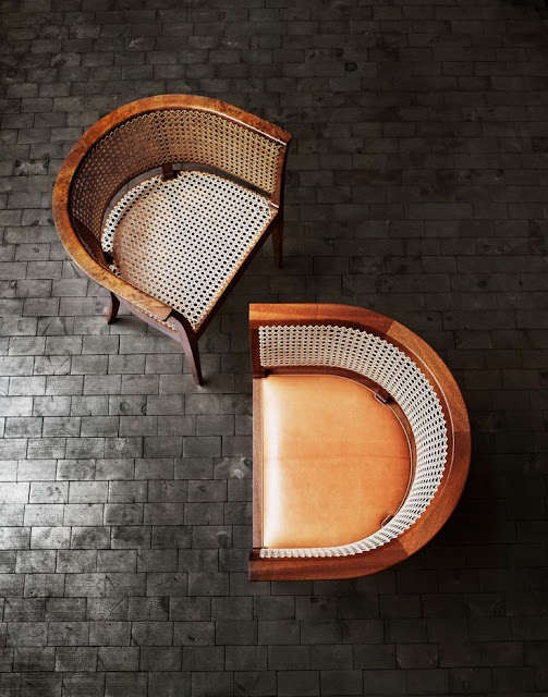
History Lesson: Faaborg Chair: The Emergence of Danish Modern


"Kaare Klint was born in 1888 in Frederiksberg and designed his first furniture in 1914, for the Faaborg Museum, the Faaborg Chair. The chair was carefully designed to fulfill its intended function: A light, moveable armchair that museum visitors could easily place in front of the painting they wished to study in detail." (Source) 

See Faaborg Museum below.


"The manufacturer, Rud. Rasmussen, has produced the chair since 1931. It was originally produced with a French canework seat, sides and back so as not to entirely obstruct the view of the gallery's beautiful mosaic floor.

Since 1964, the chair has been manufactured with a fixed padded seat, which can be upholstered in goat hide, oxhide, or fabric. 

The chair is manufactured in mahogany, European cherry, ash, or oak, and comes with handwoven French canework on the sides and back. "


"Kaare Klint is known as the godfather of modern Danish design. As a member of the older generation, he was an influential founder and teacher at the furniture school of the Royal Academy (1924). There he helped create the fundamental approach and shape the views of some of most of renowned designers of the Danish Style." (Source)

"Klint’s designs appear very traditional-looking to our modern eye, and some are even a little clunky. That was refined by his successors, Ole Wanscher, Børge Mogensen, and some others. Poul Kjærholm was another; he worked in steel, marble, glass, and industrial materials." (Source)


See other works of Klint below.


"The period that is considered Danish Modern would be 1930 to 1970, but the real growth in the movement took off in the postwar period. Danish Modernism came about because of all that post-World War II growth and the need to supply goods for an expanding population." 

"Did the Danish Modern movement parallel the Mid-century Modern movement, or were they pretty separate? They share roots in the 1930s and the Bauhaus, in the steel movement in Holland, and in similar movements in the U.S., but they were ultimately separate. Unlike designers in the rest of Europe, they weren’t throwing out historical form, by and large (like that of the Mid-century Modern). They still had a love of traditional materials. In America—we’ve always been the melting pot—you see the whole range. A lot of our American manufacturers overtly copied Danish design." 

Check out these wonderful Danish Modern inspired spaces.