Monday, February 29, 2016

History Lesson: Fornasetti


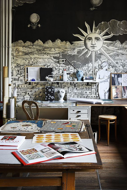
"Piero Fornasetti was an Italian paintersculptorinterior decorator and engraver.
He created more than 11,000 items, many featuring the face of a woman, operatic soprano Lina Cavalieri, as a motif. Fornasetti found her face in a 19th-century magazine. “What inspired me to create more than 500 variations on the face of a woman?” asks Italian designer, Piero Fornasetti of himself. “I don’t know,” he admits, “I began to make them and I never stopped.” The “Tema e Variazioni” (theme and variation) plate series based on Cavalieri's face numbered more than 350.
Source
Other common features in his work include heavy use of black and white, the sun and time. His style is reminiscent of Greek and Roman architecture, by which he was heavily influenced.
Source
Today it is most common to see Fornasetti's style in fashion and room accessories such as scarves, ties, lamps, furniture, china plates and tables.
Foransetti Studio
His son, Barnaba Fornasetti, continues to design in his father's name.
Here are a few beautiful interiors using Fornasetti pieces:
Source
Source
Source
Source
Source
Source
Source
Source
Source


Upper Cabinet Alternatives


The last 10-15 years has seen a major shift to open floor plans when it comes to the space planning of the kitchen, dining, and living areas. Last year, our blog also addressed a more recently seen shift to less cabinet doors and more drawers in the kitchen. Now, kitchen design is seeing another big shift, alternatives for traditional upper cabinets. Today, you will find that less upper cabinets are being put into kitchens, or many times, they are laid out in a new and different manner. Check out some fabulous kitchens with great upper cabinet alternatives.

More Windows

Above: Having less upper cabinets means more room for windows. Open your kitchen up, not just to your living room, but to your backyard.


Above: This kitchen has upper cabinets framing the large window. In this kitchen you get both, ample cabinet space and a large window. The cabinets here are also white and flat paneled, giving the illusion that they are the walls. 

Recessed

Above: Recessed cabinets also give that same illusion that they are the wall or apart of the wall. Here the recessed shelves are also the same color as the wall, to look all as one entity.


Above: All of the cabinets, uppers and lowers, have been recessed into the walls. This is very aesthetically pleasing and gives the feeling that the kitchen is more spacious. Nothing sticks out from the walls, providing no obstacles to move around.

Open Shelves

Above: Instead of china cabinets, open shelves are now a great way to display your dishware; and this way, your dishware now becomes a part of the design. Having mostly shelves in your kitchen makes it feel more open and spacious.


Above: If you don't want everything in your kitchen in display, it's great to have a combination of both open shelves and cabinets. This way you can display only pretty things and hide all the rest.

Open Storage Boxes

Above: These cabinets are somewhere in between open shelves and cabinets. The "box" frames the shelves; this effect has a little more of a formal feel to it. Also, it allows you to change the material behind the dishware, notice the dark walls behind the dishware in this photo that matches the lower cabinets.

Glass Doors

Above: Bringing in more glass doors on your kitchen's upper cabinets is also a great way to "open up"  your kitchen. Glass and mirrors help give the illusion that a room is larger. It is also a great way to display your nice dishware.

Lift-Up

Above: This is a new style of upper cabinets. The doors lift up instead of opening to the left or the right. This is more ergonomically efficient. Instead of having to peer around a door or knocking them against each other, you just lift them up out of the way. Some even lift up and push back into the cabinet.


Thursday, February 18, 2016

Industry Ed with Richard: Quick Tips Series

In this post I will discuss quick tips that can be helpful when making simple updates to your home or even when full-on remodeling. I will be providing insight on solutions and practices based on my industry experience.


Outdated Brick Fireplaces 

Do you have an old brick fireplace that is looking a little outdated?


This is a kitchen and living room that I helped redesign. The fireplace, as you can see, was looking a little outdated...


Not only can the color and style of the brick become out-of-date, but so can the mantel. But a simple thing can be done to enliven an out-of-date fireplace. 

CHECK OUT WHAT WE DID TO ENLIVEN THIS FIREPLACE.


A very simple way to enliven old brick fireplaces is to fill in the mortar between the bricks. This way, the mortar becomes flush with the face of the brick. This softens the texture and makes the fireplace look a little less busy. Next, just replacing the mantel with a simple timber mantel will do wonders. These days mantels are much less decorative, but not at all less alluring.


I hope you enjoy the information in my blog! Please don't hesitate to contact me if you have any questions! - Richard

Wednesday, February 3, 2016

Exterior Lighting: Enhancing Architectural Detail and Providing Safety

Proper Exterior Lighting is not only important for providing security against intrusions and even such things like falls, but also for enhancing the architectural details of your home and the beauty of your property. Outdoor lighting allows you to take advantage of your outdoor spaces after dark. Outdoor lighting can also add value to you home.

Important Places to put Lighting: 


1. Front Entrance

Lighting the front entrance enables you to greet guests and identify visitors. You can use such fixtures as sconces on either side of the door way, or if you have a porch, recessed can lights or chandeliers/pendants.


Source

2. Outside of Garage

Lighting the garage is important for safety. Often times, motion censored lights are used in this application. Other types of light used include, uplights, barn lights, and sconces.

3. Steps, Paths and Driveways

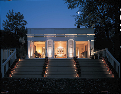
You want to illuminate your pathways so that you and your guest can easily and safely move around your house after dark. These lights should be low-level and can be installed directly along the paths or in adjacent beds.


Source

4. Decks, Porches and Patios

Our decks, porches and patios are our relaxing and/or romantic evening retreats. Here you can conceal lights in steps, benches, and railings. To make it more romantic, you can use more decorative lighting, like string lights, lanterns, or chandeliers.


Source

5. Pools and Fountains

Illuminating your pool is important for safety. Underwater lighting provides both beauty and safety. "Low-voltage and LED lighting are popular sources for ambient pool lighting, or install fiber-optic lighting to create a starry background in your pool's floor and around its edges. Floating and solar-powered lights are also available." (American Lighting Association)


6. Grills and Serving Areas

Here you need task lighting to accomplish your activities. Such lights can include , recessed cans, pendants and wall sconces.


 Best Lighting Techniques:

Source

1. Have a Focus

Most always your front entrance will act as the main focus of your home. This makes your house seem welcome and inviting.


2. Highlight Trees

Give presence to your trees by illuminating them, either with uplighting or with a light mounted in the tree itself.

Source

3. Use Uplights

Uplights are a great way to highlight important architectural features of you home. Shine them up the walls of your house or along fence lines for dramatic effect.


4. Combine Beauty and Function

Adding lighting to plants along a pathway will serve as both a way to light the pathway and to call out featured plants. This also allows the pathway lighting to be more subtle than say a run of lights down the walkway.

Source

5. Vary the Fixtures

Layering the types of lighting used is more aesthetically pleasing than just using your average spots and floods.
6. Stick to Warm Light

Warm light is more subtle and, well, WARM. Good for setting mood and ambiance.


7. Orchestrate

"A timer, with confirmation from a photocell, brings the display to life as the sun sets. At midnight it shuts shut down everything but security lighting. Some homeowners even set the timer to light things up an hour or so before dawn." En

Tuesday, February 2, 2016

Trend Alert: Simple Box Hoods


Lately we are seeing a trend of super simplified hoods in kitchens.  Just as we have been seeing a trend for less upper cabinets, today's kitchens are sleek and functional.

Source
Source
Source
Source
Source
Source
Source
Source

Source
Look at those Bar Stools! See the history Marcel Breuer Chair in one of our past blogs here. 

Link