Friday, June 30, 2017

Using Mirrors in a Big Way

Source

Nothing makes an impression like and impressive mirror. Using mirrors in a big way can make a space come alive. Size is often key. You have to think about how the mirror will interact with the rest of the space, as well as how well it is filling the space in which it is placed. A big mirror will really open up a space. Check out how these spaces use mirrors in a big way.

The Mirrored Wall

Mirrored walls are no longer a thing of the past. Everything comes back around, bigger and BETTER than before! Not so sure? These pictures will surely convince you.

Source

Source

Source

Source

Source

Source

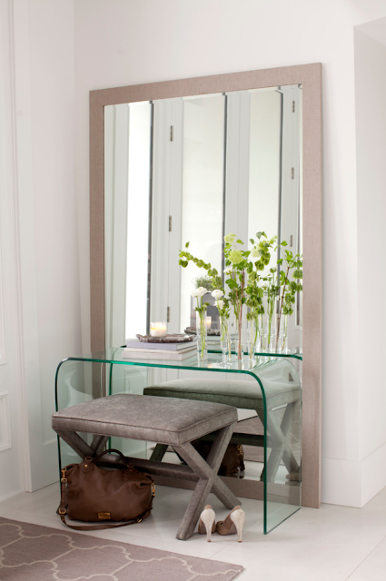
The Wall Leaner

Have you heard? The thing these days is to let your GIANT mirror just sit on the floor and lean on the wall. Less stress on you trying to put it up, less stress on the wall trying to hold it up, and it looks great. Win WIN.
Source

Source

Source

The Flank

Flank a doorway, flank a bed, flank a fireplace! And don't worry, you can still place things in front of the mirror!

Source

Source

Source

The Back Splash

Yes, you read it right, back splash, like in your kitchen!

Source

Source

Simple and Big

Source

Source

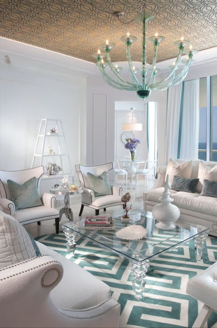
Trend Alert: Acrylic Accents


Nothing says "modern" like the look and feel of acrylic (A.K.A. Lucite or Plexiglass). The clear simplicity of the material invokes a sense of science fiction, like a scene from Blade Runner or Back to the Future Part II. This has allowed it to stay in popular design ever since its introduction in the 1930s. However, acrylic's inherent versatility allows it to work with any design style, not just modern.


In visual terms, clear acrylic can work with any color scheme. In rooms dominated by colorful patterns, acrylic accents are great because they don't take up any extra visual space.


Acrylic is almost impossible to break on accident, making it perfect for shelving and storage. As a plus, it's easy to clean. Keep in mind. you might be tempted to use a glass cleaner like Windex, you should stick to using only plastic cleaner and microfiber cloth on acrylic surfaces. Keeping acrylic clean will also compel you to keep what's on or in it nice and organized (or fashionably unorganized).


Thursday, June 22, 2017

Industry Ed with Richard: Kitchen & Bath Guideline Series - Showers

In this post we will discuss the NKBA Kitchen and Bathroom Planning Guidelines, by first stating the guidelines and then pointing out their importance and giving insight on solutions and practices based on my industry experience. Find out more about NKBA here.

Showers


NKBA Guidelines

  • The minimum interior shower size is 30" x 30" or 900 square inches, in which a disc of 30" in diameter must fit. 
  • The shower controls should be accessible from both inside and outside the shower spray and be located between 38" and 48" above the floor depending on the user's height. 
  • Grab bars should be placed at 33" to 36" above the floor and must be 1.25" to 2" in diameter and extend 1.5" from the wall.

My Experience

  • If you're including a seat, your shower should be at least 54" x 36". 
    • Having a seat is a good idea if you want to sit down or scrub your legs easily. 
  • If you want room for two shower heads, your shower dimensions should be at least 60" x 36".
    • Generally, your shower heads should be about 72" A.F.F. (above the finished floor), depending on your height. 
  • Handheld shower heads are great if you don't want to get your hair wet or if you have trouble cleaning those hard-to-reach places.
    • Handheld shower heads are also great for, if anything, cleaning your shower.
  • The biggest challenge when designing a shower is water consumption. Tankless water heaters can help, but it's important to discuss with your plumber. 
  • Shower doors should extend to about 80" - 84" A.F.F.
    • Doorless showers are becoming more popular, but it's important to keep shower head placement in mind so that water doesn't leak out into the room. 
      • You want at least 2.5' of space between the threshold and the main shower area.
      • Keep in mind that your valve can be placed apart from your shower head, allowing for valves near the entrance with the head a safe distance away. 
  • Curbless showers look fantastic and are great for accessibility. For more info on curbless showers, check out our previous blog post. 

Tuesday, June 6, 2017

Simple yet Impressive: Simple Cabinet Door Styles that make an Impression

Source

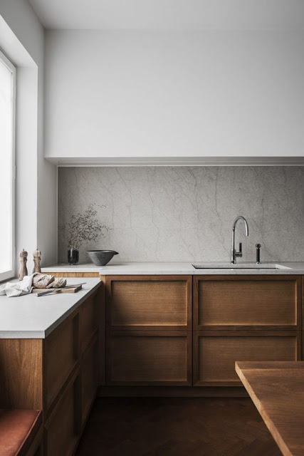
Going simple never means compromising the quality of design. In fact, simplicity is a strong trait of the, continually rising in popularity, transitional style, which pairs traditional and contemporary styles together. With the transitional style we have seen a real shift from the more traditional and ornate cabinet door styles to doors that are a little more simple. A simpler door style is more versatile. As design trends come and go, the cabinets will withstand the changes. And the plus side? Less intricacies equals less nooks and crannies to scrub clean! Here are some simple door styles that make the best impressions!

Source

Source


Source

Source

Source

Source

Source

Source

Source

Source

Trend Alert: Low-lying Beds


These days it seems like beds are at an all time low. Many mattresses no longer require a boxspring, and some modern bed frames rest only a few inches above the floor. Some consider this trend inconvenient - who wants to squat that low just to get in and out of bed? Others see it as an innovative and sometimes necessary design choice. 


For rooms with lower ceilings, a lower bed is an obvious choice, but even in a room with a higher ceiling, lowering the bed is a simple and stylish way to free up some wall space for decoration. 


In terms of practicality, lower bed frames can be used for extra storage space and even upgraded to house power outlets and USB ports. 


Whether for convenience or aesthetic, low beds are catching on. If you choose to feature a low bed in your bedroom, make sure the rest of your furniture fits proportionally.